5HAW
An old data scientist learning new tricks in 5 hours a week
Week 3: Making an animated map using maps, ggplot2, and gganimate
For week 3, I decided to take the clean Maryland Poison Control data that I created in weeks 1 and 2 and create a map of Maryland showing the rates of exposures by county. Additionally, I wanted to animate this map to show how these rates change over time.
Time this week: 360 minutes (6 hours)
Total time (across 4 weeks): 1,482 minutes (~ 24.7 hours, ~ 6.2 hours/week)
I spent 6 hours on this project this week, with the time breakdown shown below. The calendar time actually encompassed two weeks, but for one of those weeks I was on vacation and so it won’t count. (As always, this time doesn’t include any blogging time about the project.)
| Mon 6.24 | Tue 6.25 | Wed 6.26 | 6.27 - 7.7 | Mon 7.8 | Tues 7.9 |
|---|---|---|---|---|---|
| 0 | 0 | 90 | 0 | 166 | 104 |
A stream of consciousness of the process for this project can be found here; this may eventually be tidied.
A final R markdown document that produces the final animated map graphic can be found here.
Here are a few thoughts on the process.
Creating a map of Maryland counties using maps and ggplot2
To create my map of Maryland counties, I followed this great tutorial by Eric Anderson, but adapting to Maryland instead of the California example he used. I thought this tutorial did a great job of briefly presenting the different options for plotting with maps in R; after working through the tutorial, it was clear that the maps package together with ggplot2 was the way to go for this project.
I started by just making a map for a single year, 2018. First I read in the MPC data, created the necesssary map data for Maryland state and counties, and merged the MPC data with the map data:
library(tidyverse)
library(maps)

### Read in MPC data
mpcData <- read_csv("./data/MPCdataFINAL.csv")

### md county line map definition data
md <- map_data('county', 'maryland')

### md state line map definition data
state.md <- map_data('state', 'maryland')

### filter to just 2018; get subregions to match
mpcPlotData <- mpcData %>%
  filter(Year == 2018) %>%
  mutate(subregion=tolower(County))

mpcPlotData$subregion = str_replace_all(mpcPlotData$subregion,", md", "")
mpcPlotData$subregion = str_replace_all(mpcPlotData$subregion," county", "")
mpcPlotData$subregion = str_replace_all(mpcPlotData$subregion,"’", "")
mpcPlotData$subregion = str_replace_all(mpcPlotData$subregion,"[.]", "")

# join mpc to map data
plotData <- inner_join(md, mpcPlotData, by="subregion")
Now I can plot the total number of human exposures by county for this year:
ggplot() +
  geom_polygon(data = plotData, aes(x=long, y = lat, fill=TotalHumanExposures, group = group), color="white") +
  geom_polygon(data = state.md, aes(x=long, y=lat, group=group), color="black", fill=NA) +
  coord_fixed(1.3) +
  scale_fill_gradient(low = "white", high = "purple", na.value="grey80") +
  labs(title="Total number of human exposures")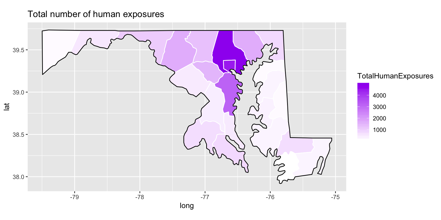
I will make the graphic prettier later, by removing axes and gridlines, but for now we can see that Baltimore County and Baltimore City (in dark purple at the top of the map) have much higher numbers of exposures than the other countiesin Maryland. However, counts of exposures are meaningless without considering the populations of the counties as well.
Adding population data from the U.S. Census Bureau
I was able to find county-level population estimates for Maryland from the U.S. Census Bureau’s Population divisiion through a search on their American FactFinder page. I downloaded this data and you can find it here. (Citation: Annual Estimates of the Resident Population: April 1, 2010 to July 1, 2018, Source: U.S. Census Bureau, Population Division, Release Dates: For counties, municipios, metropolitan statistical areas, micropolitan statistical areas, metropolitan divisions, and combined statistical areas, April 2019.)
Now we can join this population data to the MPC and map data, but first we need to convert this wide data format to a long format:
### county population data
popData <- read_csv("./data/PEP_2018_PEPANNRES/PEP_2018_PEPANNRES.csv")

# wide to long format; get subregions to match
popLongData <- popData %>%
  select(`2010`=respop72010, `2011`=respop72011, `2012`=respop72012, `2013`=respop72013, `2014`=respop72014, `2015`=respop72015, `2016`=respop72016, `2017`=respop72017, `2018`=respop72018, subregion=`GEO.display-label`) %>%
  mutate(subregion=tolower(subregion)) %>%
  gather(Year, Population, `2010`:`2018`) %>%
  mutate(Year=as.numeric(Year))

popLongData$subregion = str_replace_all(popLongData$subregion,", maryland", "")
popLongData$subregion = str_replace_all(popLongData$subregion," county", "")
popLongData$subregion = str_replace_all(popLongData$subregion,"'", "")
popLongData$subregion = str_replace_all(popLongData$subregion,"[.]", "")
Plotting exposure rates by county
Now we can join all three data sets (MPC, map, and population) together and create an exposure rate variable with exposures per 10,000 people:
plotData <- inner_join(plotData, popLongData, by=c("subregion", "Year"))

# create THE per 10,000 rate variable
plotData <- plotData %>%
  mutate(theRate=TotalHumanExposures/Population*10000)
And finally make a plot of 2018 exposure rates by county:
ggplot() +
  geom_polygon(data = plotData, aes(x=long, y = lat, fill=theRate, group = group), color="white") +
  geom_polygon(data = state.md, aes(x=long, y=lat, group=group), color="black", fill=NA) +
  coord_fixed(1.3) +
  scale_fill_gradient(low = "white", high = "purple", na.value="grey80") +
  labs(title="Total number of human exposures")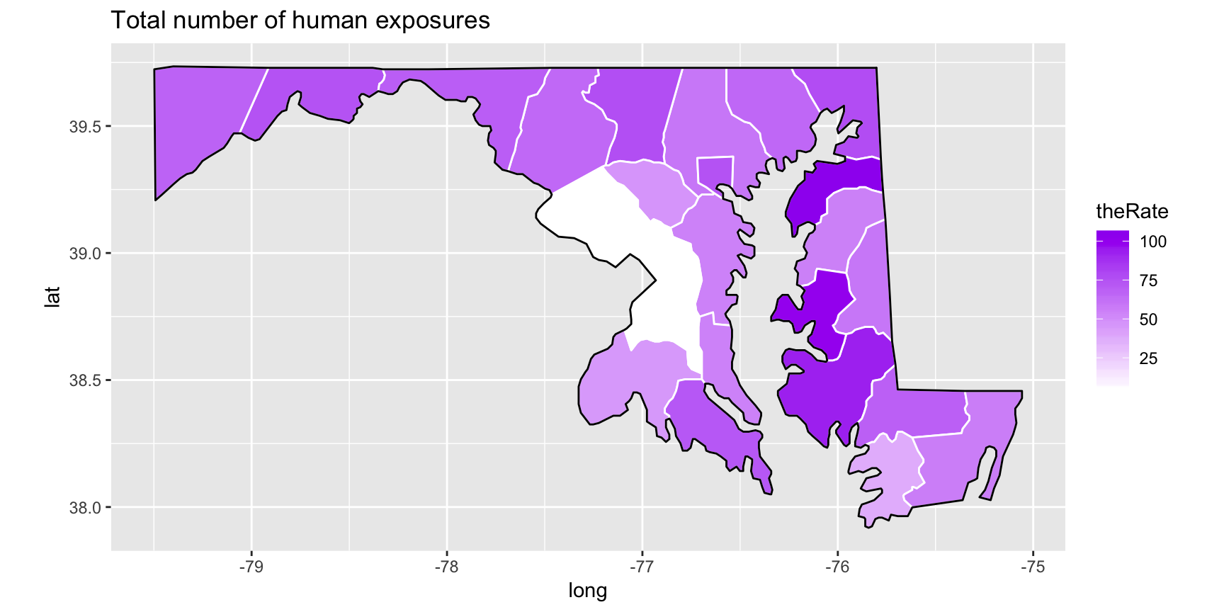
Now the rates are more comparable across counties, with the exception of Prince George’s and Montgomery Counties, which show a rate close to 0. This is because the Maryland Poison Center only receives a portion of calls from these two counties, with many call being routed to the National Capitol Poison Center (NCPC) in the District of Columbia. To get an accurate picture of the exposure rate in these counties would require additional data from the NCPC, so instead we want to exclude these two counties and fill them with gray on the map.
plotData <- plotData %>%
  mutate(theRate=ifelse(subregion=="prince georges" | subregion=="montgomery", NA,TotalHumanExposures/Population*10000))

ggplot() +
  geom_polygon(data = plotData, aes(x=long, y = lat, fill=theRate, group = group), color="white") +
  geom_polygon(data = state.md, aes(x=long, y=lat, group=group), color="black", fill=NA) +
  coord_fixed(1.3) +
  scale_fill_gradient(low = "white", high = "purple", na.value="grey80") +
  labs(title="Total number of human exposures")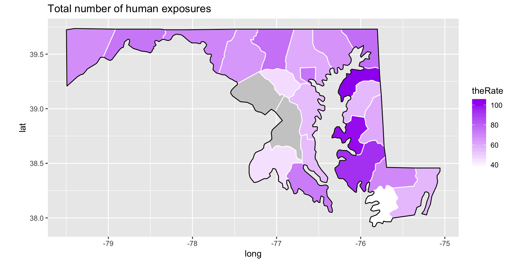
We see that by removing the artificially low rates for these two counties, we are also able to see more differentiation between the other counties since the exposure scale has been re-scaled to a new lowest value.
Animating exposure rate map over time using gganimate
The last step was to animate the graph using the gganimate package. Again, I chose to figure this out by reading through an online tutorial: Animating your data visualizations like a boss using R. After reading through this tutorial and tweaking, I was able to make a very nice animation of the exposure rates by county over time.
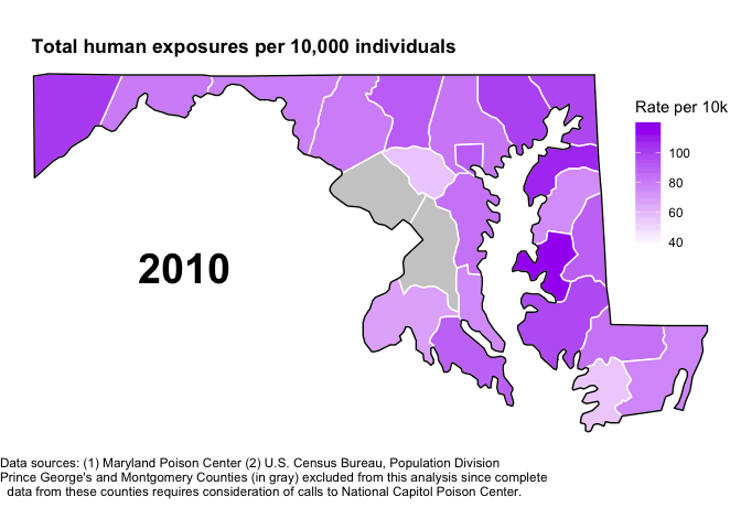
You can find the full code for this animation here. It includes additional code in ggplot to make the graphic prettier, but note that once the graphic is set in ggplot, animation require only a few additional lines of code. After fully creating my map and storing it as upgradedMap, from there animating it is pretty straight forward!
# animate and add year label to animation
animatedMap <- upgradedMap +
  geom_text(data=plotData, aes(y=yloc, x=xloc, label=as.character(Year)), check_overlap = TRUE, size=10, fontface="bold") +
  transition_states(Year, 3, 20)

# save as gif
mapGIF <- animate(animatedMap)
And it’s easy to save the animation as a gif as well:
anim_save("MPCmap.gif", animation=mapGIF)